
Cancer target discovery
Dependency map
Data portal to share analysis and discovery of biomarkers for cancer therapeutics
The background
The Cancer Data Science group within the broad institute have continuously sequenced thousands of cancer cell line ranging in 67 different cancer types with 40% of lines categorized as rare or pediatric cancers. The group has developed an ML algorithm to accurately predict the dependency of these cancer cell lines to specific genes coining the name “The Cancer Dependency Map” (DepMap). These dependent genes in theory would be targets for therapeutics and successfully knocking out these specific genes without harming the target tissue can essentially limit the growth of the cancer. The team is regularly increasing the number of samples and rerunning the sequencing of all the cell lines quarterly to gather longitudinal data to inform the algorithm and to continuously release the data to the cancer research community.
The challenge
The team produces terabytes of data, and the value is the analysis that makes the data accessible, and the normalization across the cell lines makes them comparable. So the team wanted to create a data portal of precomputed data and analysis to present to the community, including analytic tools to browse and discover the data set.
I was brought onto the team as the sole designer to help design the portal and it’s interactive data visualization tools but since there was no portal at the time, and I also designed the architecture and created the branding.
My design priorities were:
Accurately portray the scientific data.
Balancing high level lookups for easy access to the data and analytic tools for deep dives into the data analysis.
Balancing Searchability vs Browsability
BONUS 1: Mobile friendly
The Solution
The main use case is that a user comes to the portal with a Gene in mind and they enter into the search bar. The primary interaction for the user is the following gene page.
Each analysis is separated onto it’s own card.
The cards are organized by user needs and associated data.
Each card gives a summary of the data through the lens of the users’ gene of interest ie., here’s the data for your gene of interest and here’s the comparison to the rest of the population.
The cards serve several purposes.
A high level summary
An entry into an analytical tool for a deeper dive
They are mobile friendly
They are repurposed for tertiary information on the analytic tools pages for supporting data and cross linking to increase browsability.
The user enters this page through a search bar when searching for a gene of interest. This is a “gene” page and it contains all of the data that Depmap team has on a gene of interest. The cards will vary depending on the available data.
Here are the available cards, they are ordered on the page from left-to-right and top-to-bottom. The top-left card is the primary dataset for the portal, it’s the “Dependency score”. The order of all other cards are defined by user needs of supporting data, so the user can increase their confidence and trust in the dependency score.
The landing page for the portal give users many points of entry into the data itself. Users that know exactly where to go would be able to search for a gene, cell line, compound or lineage. New users would be able to quickly scan the “Use this portal to:” section to identify what tools and analysis are available on the portal and click through to see examples.
Here are some examples of the deep dive tools available on the portal, user would enter into these tools either through the data cards or through the tools dropdown menu. Entering a tool through a data card would automatically populate the tool with the analysis defined from the card. Entering a tool through the dropdown menu, the user will will need to define the parameters themselves.
In addition to written documentation that I would create, I also created quick “how-to videos” to help users get familiar with the tools. I would write the script and review with our computational biologist, then record the audio and screen interactions and compose the videos for the final product.
The process
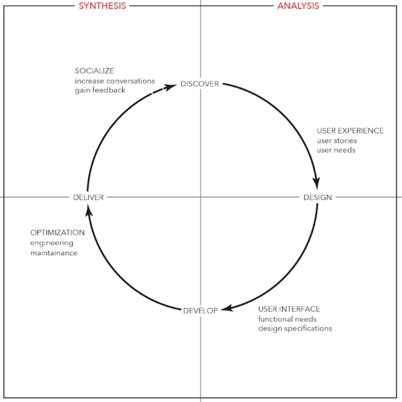
Here’s the iterative design process that I used for all of my Depmap portal work.
Details process is down below.
AT = Me
CDS Stakeholder = Cancer Data Science computational biologist
Researching the domain and understanding the data is usually the first step for me. I will meet with the content experts to comb through the analysis and data to understand what the shape of the data is to understand the metric that we’re presenting to the users.
After meeting with the computational biologist to get a better understanding of the analysis and data behind the metric. I would start to map out all of the user requirements along a user flow and would prioritize our main use cases but build in interactions to solve edge cases. I would then start to map out the user interactions needed along the user flow.
Since these are all new analysis, I’ll start to create wireframes from the defined user flows and requirements. I’ll start with many ideas and will start to refine the design with consideration of development cost. At this point once I have a visual for users to react too, I’ll create clickable designs to start testing and getting feedback from our users. I will usually need to give background on the new analysis and what the value it brings to the portal.
With feedback from our users I’ll refine the design of the UI, but during the same interviews I’ll ask questions regarding the interpretation of the visualization and data. I’ll then visualize the data in a few different forms to get feedback from our users to see which is the most intuitive when trying to understand a new dataset.
At this point after defining pain points and user needs and solving for the major use cases, I’ll start to refine the design to produce final design and a hand-off document to work through development with the engineers.